Book Lovers Inc.
Romance Novel Reviews, Author Interviews, Commentary
The Good, the Bad and the Are-You-Kidding-Me? + Giveaway
Here we are again, the shallow Book Lovers aslo known as Caroline and Susi.
So we had 2 super exciting weeks of voting and here are the results from last times polls:
Slave to Sensation by Nalini Singh
US Cover: 7 votes
UK Cover: 21 votes
German Cover: 21 votes
Japanese Cover: 6 votes
Thai Cover: 9 votes
A draw between UK and the German cover.
Visions of Heat by Nalini Singh
US Cover: 10 votes
This week we chose Kresley Cole‘s Immortals After Dark Series. Caroline found the French cover some time back and fell in love with it. So the wild discussion about covers started again. *big sigh*
A mythic warrior who’ll stop at nothing to possess her…
After enduring years of torture from the vampire horde, Lachlain MacRieve, leader of the Lykae Clan, is enraged to find the predestined mate he’s waited millennia for is a vampire. Or partly one. This Emmaline is a small, ethereal half Valkyrie/half vampire, who somehow begins to soothe the fury burning within him.
A vampire captured by her wildest fantasy…
Sheltered Emmaline Troy finally sets out to uncover the truth about her deceased parents–until a powerful Lykae claims her as his mate and forces her back to his ancestral Scottish castle. There, her fear of the Lykae–and their notorious dark desires–ebbs as he begins a slow, wicked seduction to sate her own dark cravings.
An all-consuming desire…
Yet when an ancient evil from her past resurfaces, will their desire deepen into a love that can bring a proud warrior to his knees and turn a gentle beauty into the fighter she was born to be?
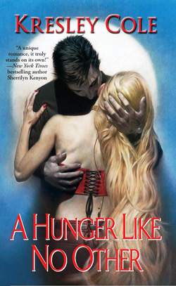
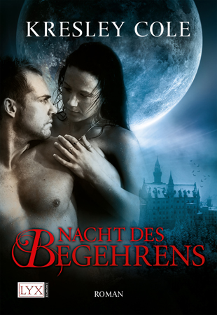
I don’t like the US cover, actually it’s the reason why I didn’t buy the book at first. My favorite is the French one (no laughing Susi!), it’s mysterious without being kitsch. And I love her eyes!! The German cover is nice too(I bet it’s your favorite *g*) but it doesn’t grab my eyes. For once I don’t find the Japanese cover too weird, it’s just…hum different! lol
I fell in love with the US cover first time I saw it. Actually it was the reason I bought this book and I still love it. I love how Lachlan holds Emma. It’s just so hawt. I have to stare at it the whole time. I like the French Version, too but I think the girl doesn’t look like Emma at all. Same for the German book. The girl looks all wrong and the guy is hairless and it should be a werewolf after all. He needs more hair. And like last time I don’t get why there always only the girls on these Japanese covers. This one is just not saying anything at all.
A soldier weary of life . . .
Centuries ago, Sebastian Wroth was turned into a vampire — a nightmare in his mind — against his will. Burdened with hatred and alone for ages, he sees little reason to live. Until an exquisite, fey creature comes to kill him, inadvertently saving him instead.
A Valkyrie assassin dispatched to destroy him . . .
When Kaderin the Cold Hearted lost her two beloved sisters to a vampire attack long ago, a benevolent force deadened her sorrow — accidentally extinguishing all of her emotions. Yet whenever she encounters Sebastian, her feelings — particularly lust — emerge multiplied. For the first time, she’s unable to complete a kill.
Become competitors in a legendary hunt.
The prize of the month-long contest is powerful enough to change history, and Kaderin will do anything to win it for her sisters. Wanting only to win her, forever, Sebastian competes as well, taking every opportunity — as they travel to ancient tombs and through catacombs, seeking relics around the world — to use her new feelings to seduce her. But when forced to choose between the vampire she’s falling for and reuniting her family, how can Kaderin live without either?
~*~*~Giveaway~*~*~
This time you get the chance to win a paperback copy of one Immortals After Dark book with the US cover.
The book will be ordered at the BookDepository so make sure you can receive books from them.
Leave us a way to contact you (email in blogger profile or twitter name is okay for us).
Share This Post
Subscribe and stay up-to-date
42 Comments
« Review: The Boat by Nam Le Next Post
Interview: Author Jocelynn Drake + Giveaway! »







 Blog RSS Feed
 Follow Me on Twitter
 My Facebook
Ok first one German cover, 2nd one tricky but will go for German again
German cover for both.
Oh come on guys you wound me lol the French cover is so pretty it should win! lol
*sigh* Germany is ahead so far! 😉
I told you the German one rocks. LOL
Still like the US cover of A Hunger Like No Other more tho.
The first one Is better the French because that woman is so misterious.
The second is a bit difficult, but I rather the Spanish because is dark and vampires are (usually) Dark.
Email: londonjest@gmail.com
@Marianna Okay admit it: you just said that to make Caroline happy?
French cover is gaining ground fast.
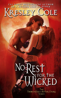
I liked the German cover for Hunger and the US cover for Wicked…thought the German cover was a close second! The German cover really evoked a dark sensual feel for me. Wicked's US cover, again gave off a dark sensual feel (despite the red!).
I like the german cover, it is dark and mysterious. I think it is the best of all of them.
twoofakind12@yahoo.com
@Marianna Woot woot The French cover rocks ! @Susi Nia nia nia!!!! lol
I liked the US covers for both of them. Maybe because it's just more what I'm used to, I don't know, but that's what appeals to me. Worst covers? Both Japanese covers are just bad.
I love the Fench cover the most! It's mysterious and I'd pick this up if I saw it at the bookstore.
I also really like the Spanish cover i must confess.
*shakes booty* Look Susi look! The French cover again *dance of victory*
lol
@pattepoilue I see we are mature again today LOL I will find enough minions for my cause. Muahah!
@Barbara I think that could be an important fact why the covers are so different. Different culture and all.
We need to find someone who likes the Japanese covers and can explain the appeal to us.
Show me some German Cover love ppl! *puppy eyes*
I like the French and Spanish covers. They just seem prettier and more mysterious.
bacchus76 at myself dot com
sorry Caroline… but Im going with the German covers for both on this one *ducks head* LOL
hugs girs!! =)))
xoxo
Thanks Larissa!
You will get a cookie!
The German covers are still on #1 place. *g*
*points finger* Ohh Susi bought you didn't she? You traitors lol
Nia nia nia Susi, you didn't even vote for the German covers! LOL *narrows eyes* This is not over!
I voted for one!
=P
For the first book, I voted for the Japanese one. It is dark and mysterious. The others, especially the US one are weird.
For the second book I don't really like any of them but if I must choose, the Spanish one looks interesting.
I chose the US covers for both. Go Red White and Blue!!!
robin [at] intensewhisper [dot] com
Oh and the why… I prefer the fuller body shots 🙂
The German cover are my favorites! tWarner419@aol.com
My choice : first -> US cover
second -> German cover
why, because They are so Great 🙂
uniquas at ymail dot com
I prefer the US cover for Hunger and the German version for No Rest for The Wicked.
Where Hunger's concerned, I love the way her back is exposed and how he holds her, like he grips her tight and there's definitely more action and raw emotion in that one picture as compared to the rest.
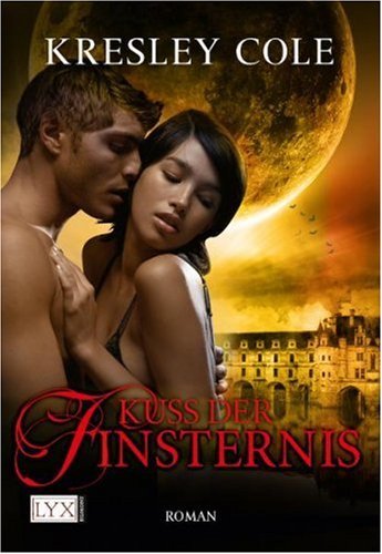
For No Rest for the Wicked, the German cover exudes a life-like quality because both their facial expressions are clearly shown. Also, its a pose that isn't particularly common and yet holds you in suspense, wanting more, as if you could feel her breath in as he pulls her close.
ilovearevolution (at) live (dot) com
@Grace Wonderfully said and I agree 100%.
*lookingaround* I love both the German covers – the full moon in the background looks great and I like the whole style… the icing on the cake is the design of the Lyx covers – the quality is awesome!
🙂
Danke Ina! And yes I agree Lyx makes the most beautiful covers here in Germany. I could frame some of them and decorate my desk with them. So pretty. My new favorite is the one Jackie Kessler and Caitlin Kittredge got for Schatten und Licht (Black and White). So pretty.
@Susi: yeah, I never get tire of looking at the new preview – one cover is prettier than the other 🙂 and they look gorgeous on the bookshelf *gg* I mean, hey, I've all the English books and still I buy the German versions solely for the covers 😉
I do that too. Mostly as a gift for friends but I loved to stroke those covers. Yep, that definitely sounds durty. LOL
@Susi: no not dirty, that way you show your love to the books *gg*
and I do that too *cough*
We French are prudes lol <===that's the only reason I'm finding for the lack of naked men on our covers!
I like the US covers for both the best. A Hunger Like No Other cover looks like the characters and is sexy. No Rest For the Wicked cover is just hotter to me. If I had to choose other than the US it would be the German cover for both because they are sexy. vsloboda@gmail.com
I like the US covers. It was A hunger like no other that got me hooked on Paranormal Romance. I read Kresley's whole series in a months time. Next was Gena's LOTU. I liked all the IAD series US covers the best =) Thanks for the contest, love Kresley cole.
Tanyaw1224@yahoo.com
I prefer both Japanese covers. I like things plain and simple with not too many bodies splattered over the front. The first Japanese cover is also quite mysterious, another plus.
eva.s.black[@]gmail[.]com
I like both of the Japanese covers. If there's no serious male torso showing, then I'd prefer something more mysterious. The Japanese cover for "A Hunger Like No Other" doesn' have the overly obvious huge moon. The Japanese cover for "No Rest For the Wicked" has a sword which is cool.
cories119 [at] yahoo [dot] com
I like the German cover for both books.
aikychien at yahoo dot com
For A Hunger Like No Other, I like the German cover best. I like the couple and the dark, gothic background.
For No Rest for the Wicked, I like the US cover because the male model is Nathan Kamp!! I'll always choose his cover!
Diana
bookofsecrets(at)yahoo(dot)com
I love the french cover for Hunger Like No Other. The colors pop more, and overall I find it more interesting than the rest, and I hate to say it but personally I find the US cover the least appealing.
For No rest for the Wicked I like the German cover and the US, but the German more, because once again I like the colors better.
rachel.coldsmom@gmail.com
for the first one I voted for the German cover. I thought it was more sexy and grabbed my attention. I like covers with actual people on it, makes it more real. For the second one, I liked the Japanese cover. They are almost kissing and it's like your witnessing something private and sexy as hell. Once again, the real life people make it more real
oops, my twitter username is joleneallcock
US cover for the first one, but German cover for the second.
I LOVE these cover wars of yours! 😀
I'm a bit undecided about the 1st one, I agree a bit with both of you: I didn't like this US cover, Lachlan"s skin looks gray to me and he looks scray. But I like the possessive way he has Emma in his arms. I really like the German cover, but agree, that the woman is so not Emma: not only because of her dark looks, but also because of the confidence and almost dominance she conveys through her body language, while Emma is the shy timid, fearful one.
Regarding the 2nd cover, no question there, the German cover wins for me. Love the colours, and the body language of the models, the woman's reluctance the way she tries to shove him away portrays Kaderin and what the book is about PERFECTLY!
Though the Spanish cover looks nice, I feel it doesn't suit the book: it looks more mysterious than hot.
Thank you!
stella.exlibris (at) gmail (dot) com