Book Lovers Inc.
Romance Novel Reviews, Author Interviews, Commentary
The Good, the Bad and the Are-You-Kidding-Me? + Giveaway
Here we are again with another glorious Cover Fight. But before we start with this weeks selection we have a winner to announce.
But first the stats of last times voting:
A Hunger Like No Other
German: 28 votes
US: 19 votes
French: 12 votes
Japanese: 6 votes
No Rest For The Wicked
US: 24 votes
German: 23 votes
Spanish: 12 votes
Japanese: 1
I so knew that the German covers rock. Muahaha! Ohhh, there is pattepoilue again. She just came back from her tête à tête with Mr. Random.org and here is the winner of one Immortals After Dark paperback copy
~*~*~drumroll~*~*~
Rachel
Congrats! You should have an Email from us in your inbox. =)
This time we will “discuss” Richelle Mead‘s first novels in her Vampire Academy Series and her Succubus series. Caroline follows Richelle’s livejournal and she noticed that Richelle got some awesome covers for her foreign releases. So here we are.
Succubus Blues:
Succubus (n.) An alluring, shape-shifting demon who seduces and pleasures mortal men. Pathetic (adj.) A succubus with great shoes and no social life. See: Georgina Kincaid.
When it comes to jobs in hell, being a succubus seems pretty glamorous. A girl can be anything she wants, the wardrobe is killer, and mortal men will do anything just for a touch. Granted, they often pay with their souls, but why get technical?
But Seattle succubus Georgina Kincaid’s life is far less exotic. Her boss is a middle-management demon with a thing for John Cusack movies. Her immortal best friends haven’t stopped teasing her about the time she shape-shifted into the Demon Goddess getup complete with whip and wings. And she can’t have a decent date without sucking away part of the guy’s life. At least there’s her day job at a local bookstore–free books; all the white chocolate mochas she can drink; and easy access to bestselling, sexy writer, Seth Mortensen, aka He Whom She Would Give Anything to Touch but Can’t.
But dreaming about Seth will have to wait. Something wicked is at work in Seattle’s demon underground. And for once, all of her hot charms and drop-dead one-liners won’t help because Georgina’s about to discover there are some creatures out there that both heaven and hell want to deny…
The Geeky Lover:
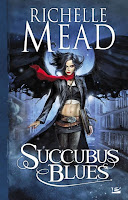
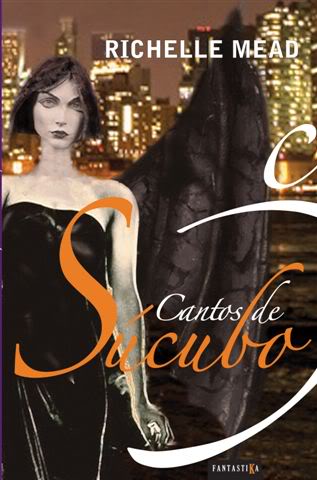
First thing I have to say is that I completely adore this series. But we are talking covers here today (*inserts hypnotic sound that makes you want to buy these books*). I really don’t like the US and the UK cover. The US one is way too blue and Georgina looks scary on the UK one. I don’t really get why they chose to make her look like that. Georgina is one of the loveliest and nicest persons ever. Why should she look so mean. I like the German one in general but it is too blue for my taste again and the girl looks too young. I really adore the French cover. It looks so pretty BUT why are there wings. Many of those cover have them but why? Did I miss something in the books? I never noticed any wings attached to Georgina’s back. Okay the Spanish cover is just gross. No one would touch Georgina if she would look like this and that would be really bad news for a succubus. The Russian one is nice too. But again the wings. If I would have to chose a favorite it would be the French one. I love the comic style and it just pretty. Even with the strange hair. (yes I know I’m really picky).
The HEA Lover:
I love French cover (surpriiiiiise!) it’s sexy and original, (but as you pointed out I have no idea why she has wings o_O). The German cover is pretty too, the color is perfect for the title. I don’t like the US cover that much, I don’t find the model very pretty . The UK cover is dark and mysterious I like it. The Russian cover looks like a bad photoshop, I think my problem is the weird wings, otherwise it would be very good. And…I kept the best for the end…the Spanish cover is FUGLY! OMG what were they thinking???? It’s horrid! It looks like a mix between a doll and a corpse!!
So my favorite is the UK cover and the French one is 2nd…and Spanish the LAST!
Vampire Academy:
St. Vladimir’s Academy isn’t just any boarding school—it’s a hidden place where vampires are educated in the ways of magic and half-human teens train to protect them. Rose Hathaway is a Dhampir, a bodyguard for her best friend Lissa, a Moroi Vampire Princess. They’ve been on the run, but now they’re being dragged back to St. Vladimir’s—the very place where they’re most in danger. . . .
Rose and Lissa become enmeshed in forbidden romance, the Academy’s ruthless social scene, and unspeakable nighttime rituals. But they must be careful lest the Strigoi—the world’s fiercest and most dangerous vampires—make Lissa one of them forever.
The Geeky Lover:
Okay first thing I have to admit is that I haven’t read these books so I can really just judge them by their cover. Man this is hard! Okay the US cover is nice but nothing unique and special. The Korean one is wonderful but a bit too much manga for me. It looks a bit like fanart. I like the German one but again it is blue. I really don’t like blue books or anything else in that color. Now it gets harder. I really really like the last 3. The Russian cover is great. I like her facial expression and it looks like a book I would love to read. And I have a soft spot for Cyrillic letters. They look so pretty. Can’t read them but pretty. The only down point is that the girl reminds me of Bill Kaulitz and that is just so wrong. The Swedish cover is awesome and finally something really different. I like the orange ornaments at the sides. I think that the initials aren’t placed very clever. And I usually don’t like to see the heroines face before I read a book. It ruins my ability to picture her for myself. I think the Dutch cover is my absolute favorite this trime. I like the brown colors and the way her hair and the butterflies morph into each other. The arrangement is awesome and I would buy this book ASAP.
The HEA Lover:
Let me start with OMG so many covers!! We only chose a few because there were a lot of them. The US cover is disturbing…the model makes me think of Angelina Jolie o_O. I kept waiting to see Brad Pitt take Rose on a date or something. I like the Gothic style of the Korean cover it fits the story. I really like the German cover, it’s sooooooo pretty and mysterious! I was surprised by the Dutch cover, her hair is gorgeous, I really like it, I only wish it was another color, because this one is a bit dull. My favorite is the Russian cover…wow it fits perfectly, this is how I picture Rose!One tough lady you got here! I LOVE it to pieces! The Swedish cover is just Blahhh, the model looks too ‘sweet’ to be Rose and the color is boring.
PS: Evil Susi…you just ruined the Russian cover for me!!! AHHhhh now I can’t help but think of Bill Kaulitz O_O
Share This Post
Subscribe and stay up-to-date
64 Comments
« Guestpost and Giveaway with Author Dakota Cassidy Next Post
Review: Frost Moon by Anthony Francis »












 Blog RSS Feed
 Follow Me on Twitter
 My Facebook
I like the Russian cover best for Succubus Blues because it just seems sexier to me. I like the Swedish Vampire Academy cover best because it's kind of right there in your face – defiant.
For Succubus Blues I choose the UK cover and for Vampire Academy I chose the Dutch cover, love the hair/butterflies thing.
I love both series, and I've got US and UK covers for both (long story as to why). My Favourite of the Succubus covers is actually the UK one. I disagree that she looks mean, it's a shadowed image, but I don't think her expression looks mean at all. For VA, it's a tougher call. I think my favourite is the US, but not by much. I completely agree the girl looks like Angelina Jolie, which is a little off putting, but in it's favor it has the VA gates. I love that touch to the US covers, and it's what makes them for me. The Korean and Russian covers are awesome and I wouldn't mind having them, but I just still think those gates make the cover. Though I prefer the new US version to that one.
@Victoria I guess I saw the heroine most mature than the model in the Swedish cover. It's just that, in my head she's tougher looking.
@Barbara I love the butterfly hair sooooooo pretty! It's not my favorite only because she looks too soft to be the heroine.
YAY someone who chose the UK succubus, take that Susi! *shaking booty in front of the screen*
(Sorry for the mental picture guys LOL)
@Cem YAY Join the ranks of the UK succubus lover (<==wait that sounds naughty lol) I agree, she's in the shadows that's all!
*neener neener susi*
Oh my, you have BOTH US and UK covers lol, See? I feel better now! phewww
@Victoria I like the Russian one too. I would like to find a bigger picture of it tho. Right there in your face. LOL
@Barbara And why?
@Cem Perhaps I need to see a bigger pic of that one too. I have only the US version here so duh. I never read the VA books so no idea about those gates.
@pattepoilue *sticks out tongue*
Lets see, for Succubus Blues I like the US cover because it looks dark and mysterious and I love the necklace.
Vampire Academy is a little harder, I'm not wild about any of them. I guess if I had to pick it would be the Russian one, don't ask me why, it just seems less lame than the other ones.
seriousreader at live dot com
ooooooh sorry Sus… but My fave Succubus cover is the French one!!! soooo awesome!!
but the VA one is the German one =)))
hehe
xoxo
@Linda 'the less lame' LOL that works for me… 😉
@Larissa YAY one vote for the French one *g* You rock (don't tell them I paid you to say that ok? lol)
@Linda I'm way too much Tokio Hotel prestressed. LOL
@Larissa No worries hon I like the French Succubus cover more too. 😉
My fave is the UK Succubus Blues cover. The pose, the woman, and the colors are perfect. I like the French version too, but to me it doesn't really go with the "feel" of the book.
As far as Vampire Academy goes, I don't particularly like any of them (although the Korean one looks interesting), so I'm going to go with the US version because I like the red.
for the Succubus series I have to go for the UK cover, but the German one is gorgeous too.
For Vampire Academy I'm not too impressed with any of them, but if I have to chose I'd pick the Dutch one.
@throuthehaze I think I'm standing really alone with my judgement of the UK cover.LOL
@Sullivan German!!! Woot! <– take this Caroline *na na na na na*
You haven't won yet Miss Susi! I haven't said my last word!
nia nia nia *stick tongue out too*
Pleaaaase pretty pleaaaase guys let me win over her for once *puppy eyes*
For Succubus Blues I will need to choose the French cover. Why? The wings, the clothes and the ABS! It kicks ass 🙂
I choose the German cover for Vampire Academy. It has a mysterious and alluring feel that the others lack. I have always though the US one looks like Angelina Jolie *winks*
robin [at] intensewhisper [dot] com
@Robin AH!! So I'm not crazy then! (well not completely) She does look like Angelina Jolie! This is weiiiiird
And I agree the French covers rock! the whole series is badass
For me, the German covers win it for both Succubus Blues and Vampire Academy! 🙂
n_monzyk_27(at)yahoo(dot)com
@pattepoilue This is called ransom sweets!!!
I can give you mancandy if you like the German one. *wink*
Ha!!!
@Robin I can't really see Angelina tho. LOL
The Swedish is blah! Just cos all the books in the series look exactly the same.
Loved the German and Russian ones, soo they got one vote each. They were eerie and cool
@Natalie Yay…see that worked before I even finished the comment! Wooooot!
@Blodeuedd Okay yep that sucks big time about the Swedish ones. Ohhhh and my evil plan is working. Muahahah!
I iz gona sic evol Lolcats on Uz!
8_o <===that's an eye twitching LOL
LMAO eye twitching? And you didn't even use the reversed b. LOL
I like the Russian Succubus Blues cover. It's very 'arty' and dramatically beautiful.
b(dot)cardone(at)hotmail
I actually like both Russian covers for Succubus and VA. Their something dark and sexy about them.
Thanks for the giveaway!
-Eleni
lafemmereaders@yahoo.com
German for Succubus
German & Russian for VA
For Succubus Blues, I absolutely love the German cover – she's so seductive looking yet with that little twinkle in her eye. I've always disliked the US cover.
For VA – I haven't read the series so I can't judge how well it fits, but for some reason, the Swedish one appeals to me the most – I don't know if it's her expression or what.
For Succubus Blue "German"
Fro Vampire Academy "Russian"
sasluvbooks(at)yahoo.com
Succubus blue would be French
VA would be us.
I really like both German covers. They just look perfect to me for the series. The US covers are nice but nothing special and the others are nice too but dont appeal to me like the German ones do.
For Succubus Blues I don't really have a favourite but if I had to pick it would be the US cover only because I'm so used to seeing it around.
For VA I like both the Korean and dutch covers. The korean one is a little freaky and its so different. The dutch one, I like the butterflies coming out of the hair and flying away.
jen4777[at]hotmail.com
For Vampire Academy, I like the US cover because the girl reminds me of Angelina Jolie (I love her!). For Succubus Blues, I'd go for the Russian cover. The girl's pose is very graceful! Funny I voted US-Russia but those are def my choices 😀
dwaynehalim@hotmail.co.uk
Woot Wooot the French cover is leading! (of course it was not the one i chose HAh!)
You guys wanna kill me right? Don't let SuZi win
I love the French cover for Succubus Blues…the woman is definitely sexy..but I don't get the wings thing either. Must be something lost in translation.
Have to go with the Dutch cover for Vampire Academy. I just like the flow of it. Its different, and it draws my eye to it.
heatwave96(at)hotmail.com
I like the Russian cover of Succubus Blues because it's sexy & mysterious.
For VA I like the Swedish one because it's so creepy!!
abibliophilesparadise@gmail.com
Vampire Academy
The US cover is nice but a bit ordinary.
I don't like photo covers so the Russian version is a no.
At first glance I like both the Korean and the German covers.
I love manga however in the Korean cover the faces are too pointy and the girls' expression unpleasant.
My objection to the German cover is that I hate an image where you are put in the position of staring up somebody's nose!
I do like the Swedish cover. I love the gates and the positioning of text. It would be my favourite except the orange of the font and the youth of the girl's face make it seem too young and less mysterious.
So my favorite is the Dutch. I love the colour scheme and the font and I really like the shape of her hair and the way it 'dissolves' in to flying birds. I even like what I can see of her clothes.
eva.s.black[@]gmail[.]com
For Succubus Blues, I like the Russian. The wings and the color, just everything makes it look so pretty!!
For Vampire Diaries, I have to go with the Dutch. I like the thing with the hair and it's simple, but pretty at the same time!
julie102794@gmail.com
I like the German Vampire Academy and the Russian Succubus Blues. I love the dark angel look on the Succubus Blues cover. It is such a dramatic look. I like the Vampire Academy cover because that is how I see Rose except for red hair. A little darker and edgier than the American cover makes her out to be.
Thanks for the contest!
ferretvamp14[at]live[dot]com
I like the German Succubus Blues with the blue cover. It has something very elegant.
And I love the Korean Vampire Academy with Rose and Vasilisa. It is also elegant and very beautiful. I love the colors.
Thank you for this great contest!
Giada M.
fabgiada (at) gmail (dot) com
I really like the Sweedish cover for Vampire Academy – it's just got the cool foreboding vibe…
bookyurt(at)gmail(dot)com
I really like that Swedish cover, it's awesome!
booksobsession(at)gmail(dot)com
Wooooot! So far guys:
for Succubus: French cover is leading
for VA: It's a close tie between Dutch and German cover!!
Go go go Vote!!!
I like the Russian cover of Succubus and the US cover of Vampire Academy.
juliecookies(at)gmail.com
I like the Russian covers for both books. 🙂
Crystal816a[at]hotmail[dot}com
For Sucubus Blues, I like the UK cover the best, I just like the girl the most.
For VA, I like the Korean cover, it's so different and unusual for books in this genre.
also voted for my favorites
spamscape [at] gmail [dot] com
i like the russian succubus blues cover the best – i love the color, and it looks so gothic! the dutch vampire academy cover is my favorite because i love the hair flying…
and yes, i voted in the polls…
k_sunshine1977 at yahoo dot com
I like the russian succubus cover, the color and pose are nice.
VA cover is more difficult to decide.. The dutch one is interesting but I also like the german cover, it looks somehow dramatic to me.
musmekipi at gmail dot com
I liked the German cover for Succubus Blues. This looks more like Georgina. I know the others aren't bad, but the winged affect throws me off because I don't recall there being any mentioning of wings to the succubus form. I could be wrong, read Succubus Blues several, several books ago!
For Vampire Academy I like the Swedish version, likely because it keeps the same gates. The gates are a big part of why I like the US covers. It brings to mind of the school and that this, for the most part, is where Rose and Lissa live and where all the action happens.
email: jessbess2505[at]yahoo[dot]com
For the Succubus Blues books I love the German cover art. It was pretty hard to choose just one though..
As for the Vampire Academy one, which was another hard one.. I choose, the German cover art. It's dark but fitting. 🙂
I follow!
natashajennex(at)gmail(dot)com
For "Succubus Blues", I like the German cover the best even though it's a bit too blue. The wings bug me, too, so most of the rest don't work for me. I like the pose on the Russian cover but, again, the wings. Even though Georgina is a succubus, she's not supposed to look scary.
For "Vampire Academy", and I have read it, I'm fine with the US cover, even if she does look like Angelina Jolie. I like the gates that much. Rose is supposed to be very tough (she guards Lissa after all) so I don't really get the Dutch cover, as cool as it is. The Korean one is okay as it shows Lissa and Rose. Maybe I'm just used to looking at the US cover.
cories119[at]yahoo.com
Wow, so many covers, we really have the choice 🙂
For SUccubus Blues my favourite is the Russian cover: I love everything: the model, the feathery winfs, the purple-ish colour. The model is seductive enough without being a tramp. The German cover looks nice too, but the model looks way too young, about 14! And the Spanish cover?! Oh my! I can't use Photoshop, but it looks like this is what I could do if I tried my hand at it! It looks horrible!
About the Vampire Academy covers: I like the UK cover (which you haven't featured, can see it here: http://images2.fanpop.com/images/photos/6400000/VA-Covers-vampire-academy-6447891-500-500.jpg), but from the ones you posted I like the German one. The Dutch is fantastic, but doesn't give me what to expect from the story. I would never think this cover matches a book called "Vampire Academy".
Thank you!
stella.exlibris (at) gmail (dot) com
For Succubus my favourite is the German cover, mostly because -besides the US cover- it's the only one who doesn't show a fake pair of wings, it looks more exquisite that way, I think; and I like the colors.
As for The Vampire Academy, my favourite is the Dutch version, love the girl's long hair blowing in the wind and those things that look like they're coming out of it(is it birds?). Really nice 🙂
Thanks for this giveaway!
jen7waters@gmail.com
i like the UK cover for succubus blues because the model rocks and i like how the author and title are displayeddown the centre of the cover.
i love the swedish cover for vampire academy because the model's face is very strong and it makes me want to know her story. i like that it's black and white with the hits of orange and i like the gate too.
stampitchick at yahoo dot ca
For Succubus Blues I like the German because it is elegant and I would buy it if i see the book with that cover at the library =D
And for Vampire Academy I like the Swedish more but only because:
1. US: I dont't like the cover because the heroine seems to be typical bitchie… (that's my impression)
2. Korean: It's too manhwa for a book cover.
3. Dutch: I simply don't like it. It's not horrible but I don't like it.
4. Russian: This, like the Dutch cover, I don't like it, but the difference is that, to me, this IS horrible.
5. German: It seems the cover of a terror book.
6. There is only the Swedish cover left =D
sandymanga@hotmail.es
For the first I like the Russian best. It just is the sexiest.
For the second, I really like the Swedish one. There is something about the eyes that shows power.
Emily D. ebdye1(at)gmail
All the Russian covers are so cool! I am seriously going to Russia when I get older and richer and buying copies!
All the Russian covers are so cool! I am seriously going to Russia when I get older and richer and buying copies!
Gosh, the Russian Covers have been my favorite so far followed closely by US Succubus and US VA!
my e-mail is on my profile!
I like the US cover and love the Vampire Academy books! I just read Spirit Bound and loved it!
cherylbaryl@Hotmail.com
Succubus Blues.. I like the Russian cover the best! German cover is nice 😀 but I don't like how the words covered her body! The US cover is… too blur? And scary, and not pretty. UK cover looks really weird, and too many words. French cover is too.. I can't find the word. I don't really like anime/manga-ish covers. 😀 gosh spanish cover is the worst! Looks superrrrrrrrrrrrr fake and ugh.
For Vampire Academy.. I laughed when you say the Russian Vampire Academy cover girl reminded you of Bill. HAHAHA! (yay I'm going to see him on 31st!) AND OMG I'M NOT THE ONLY WHO THINKS THE US COVER GIRL LOOKS LIKE ANGELINA JOLIE! Disturbing indeed, because I keep thinking of her as Angeline Jolie -_- Oh US cover is nice but her body is larger than her head (angle problem I know) and she looks like angie jolie! Korean is too japanese and manga. German cover is nice! I like the blue hair, heavy eye make up and scary-ish cover 😀 Dutch cover is nice too! I like the hair! Russian cover is nice, and I really like the VA thing! but I think this picture should be on a magazine cover, not a book cover. Oh Swedish, what's with the words on her nose, and the gate thingy poking her nose and covering her lips and chin. This is hard, but Dutch cover is my most favourite I guess.
feeyonachan at gmail dot com
My favorite VA cover is definitely the Russian cover! The girl on the cover looks most like the Rose in my mind. She looks pretty but dangerous.
My favorite SB cover is the German one, with the French as second!
sara
yavampire(at)hotmail(dot)com
First off great giveaway! I am a big fan of Richelle Meads!
Succubus Blues I like the German one best and also the German one for Vampire Academy!
chidoryx@hotmail.com
My fav is the Russian cover for Succubus Blues. What a great cover. Love the wings.
lizzi0915 at aol dot com
I like the Russian cover, with the wings and dark and sexy look it just stands out.
hdtermite at yahoo dot com
twitter Carmen_R
I'm going to go with German on both series simply b/c I'm one of those dreaded people that buys books based on cover (unless I've heard anything about it.)
Both of those covers would make me pick them up for purchase.
sarabrown101 at hotmail dot com