As a photographer I tend to look at things from a slightly different eye than most people – I don’t have my pricing set up like a “typical” studio, I don’t “make” clients pick certain photo’s, I do my best and THEY get to pick which photo’s they like best out of maybe 15-20 of the best shots…
The reason? What I would pick, is almost 100% NOT what the parent likes best…
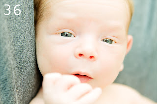
One shining example I got just today…I worked with little beautiful little boy, and today his parents ordered the photo’s they wanted from our session – me, I would have picked this one as my favorite…
But his parents, they picked this one….
Now don’t get me wrong, the one above is great, I love it too BUT it’s so typical, normal – they even asked me to crop it so he’s more centered.

The shot I picked, I picked because it showed him 100% in his element, caught off guard, in a moment that’s 100% his, no one’s coaxing him to get a great shot, he’s laughing just because he wanted to laugh!
I am much the same way when it comes to the book’s I love, as well as there covers – I covet covers for an entirely different reason, I look at them as statements, as a first impression; I look for those that not only jump out at me, but also those that offer something different!
Take the cover of
Laura Kreitzer’s upcoming book
Soul Stalker book 2 in the
Timeless series. It’s beautiful, and totally unique – when was the last time you saw flames coming from the title? Not to mention an angel blowing, is that smoke? I love everything about it, the darkness, as well as the light – the colors are captivating!
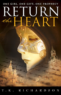
Then there’s T.K. Richardson’s Return the Heart, another example of a beautifully done cover. It’s intriguing, the mask, the writing, not to mention the brief outline of the buildings, this cover is one that leads me to WANT to know more! It’s one of those covers that does not “center on the center” – this cover draws you in, to where your looking at and taking in the whole thing!
Another example of, to me an excellent cover is
Intrinsical by
Lani Woodland, of course Lani is also a photographer, so there’s no doubt why she has an amazing cover. BUT, the reason’s I love this one is first of all the colors, I also love the fact that Lani took the time to recognize where the model’s limbs were being “cut” so as to not to cause a break right at the joints
(which looks awkward). I love that the model is not looking at us, she’s floating there, looking towards something that none of us can quite see – which draws me in, makes me want to know more!
When your talking about faces for me, on covers – I covet books like
Forget You by
Jennifer Echols along with
Winter Longing by
Tricia Mills – both of these examples show a perfectly beautiful, tender moment, seemingly cough off guard – which to me, is perfect!
Then, sadly you have some covers I REALLY dislike Return to Paradise by Simone Elkeles (don’t get me wrong LOVED the book) but the cover, not so much…they look like there in pain, AND like they are brother and sister!
I also really enjoyed Birthmarked by Caragh M. O’Brien but the cover, not even close, what’s with the thread coming down from the top, I don’t get it…or why her hair is in her face!
Then you have the covers that 100% make sense, but only AFTER you’ve read the book, like
Elizabeth Isaacs The Light of Asteria – don’t get me wrong, my favorite color is purple, but it does not “scream” to me – come, buy me, I am excellent! Yet at the same time, once I finished reading it, the cover was pitch perfect.
Bottom Line with all this is, as a photographer I bring a totally different eye to covers, as everyone does – so while I do think covers are important, I also think that what your prospective is looking at them makes or breaks them!

About Book Lovers Inc
 The shot I picked, I picked because it showed him 100% in his element, caught off guard, in a moment that’s 100% his, no one’s coaxing him to get a great shot, he’s laughing just because he wanted to laugh!


 Blog RSS Feed
 Follow Me on Twitter
 My Facebook
Hi Jennifer!
thanks so much for your post today! I understand you although I'm not a photographer, but covers are very important to me and every time I see a wonderful one I'm really happy…
and I would have picked photo # 2 of the boy – he's really cute 😉
greetings, Ina
Ooo, you're right, Return the Heart does have a gorgeous cover. In fact, I think I need to google this book to find out more…..
great post! Cool to hear from a photographer about covers. I would have picked the same pic of the little boy you did.
Nice post, I see what you mean with the Return to Paradise cover.
I know exactly what you mean..my clients always pic a different favorite then me! I'm actually in my senior year of a bs for photography!