Welcome back! This week we’ve decided to try and take a look at Italian covers. We thought the covers would reflect Italy’s beauty but we were sadly a bit disappointed. Instead of eternal beauty and timelessness we found clichés and well…you will see for yourself. Be sure to let us know what you think about our selections.
Caro: O_O Well first I don’t find the cut out faces to be very attractive in the first place but if you add the weird “hey my make-up is running” part it’s just plain weird.
I like the Nalini cover. The wings are for once original. It’s simple but good. (also i have a secret thing for curly-longish hair on a man) <==that’s a man right? LOL Ouuhhh I am so mysteriouuuuus, look at my mysterious eyes and mysterious hair in my eyes. ⇐= o_O is all I’ll say.
Susi: Okay I admit the make up is weird I love the athmosphere. It so fits Z and Bella. Dark and stromy- me likey. I’m not so much for the Nalini cover. The focus is too much on the tattoo which isn’t in the book. That irks me. >.< And well that Adrian cover reminds me of her German covers. They all look a bit alike. So it’s okay but yes his hair is weird.
Susi: Is Rachel a werewolf? Why does she have scratch marks? Reminds me of that one anthology cover by Tony Mauro. I don’t like the white bar at the top. I like parts of the Emma Holly cover but together they don’t match. I don’t think that violet and red work together. They should decide on one or choose another color which would bring some contrast to the cover. And yes I agree about the Frost cover. It’s so “new” to make the font blood red. *rolls eyes*
Caro: Well Rachel is a redhead and is pretty white skinned…exactly the contrary of the model on the cover. Nice going! Also it looks a LOT like the covers of Rachel Vincent’s werecat series. Just sayin’.
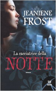
The Emma Holly and Jeaniene Frost covers are just MEH. It’s been done before…like a thousand times.
Caro: Well I guess my first thought was…who’s this woman on the Jeaniene Frost cover? I mean come ON, she’s a brunette O_o… o_O Just a meh cover.
The Summoning isn’t bad at all. I like the mysterious feel, with the forest and all. Actually I like it. =)
Puh-leaaaaase…what’s up with the white paper trees? o_O And damn I sure hope the models are moving otherwise that’s one strange pose to take LOL To me it looks like she’s sitting on a kitchen counter. Don’t ask me why, I’m weird like that.
Susi: Well is that a Cat & Bones book? Or one of the spin-offs? That is not Cat, even though the cover itself looks alright. A bit dark. The Armstrong cover looks so nothing saying and her pose screams boring to me. Wouldn’t buy that one. For the last one: I think the curly font plus the trees is a bit too much. All those swirly thingies distract to much from the dancers.
Susi: The first thing I think about the Sands cover is: OUCH. Well I know how this vamp thing works but still OUCH. Otherwise it’s pretty plain. I never read Saintcrow‘s YA titles but I really like this cover. No idea if it is like the book though. It looks mysterious and I love the moon in the background. The Clare cover looks like the model has a skincondition and well that’s not much appealing. LOL
Caro: Too much happening on this cover. It could be okay if you take away the huge title and all the huge quotes and subtitles. Still I don’t like how we see that woman’s back bones. *shudders*
The Lili St Crow covers suffers from the huge ass moon syndrome. Have you EVER looked at the moon? If it was this big you prolly ate mushrooms not long before. Also the wings make me think of a giant bat. (no I’m never happy)
The only explanation I have for this cover is that this man/boy has Alien-Pink-eye…which is why it’s blue. Hey happens all the time! (that or he’s a Jared Leto fan *hides from the murderous fangirls*). Ok the critizising apart, it’s not a BAD cover. It’s just a bit weird…and blue.
Caro: I think ‘WTF’ describes pretty well these 3 covers. First WHY is Sookie a brunette? Unless this is not Sookie? And I won’t even talk about the fake blood…*caro not talking about the fake blood*.
Kererlyn Sparks also known as the author who gets the worst international covers. Not sure who she angered but she didn’t do a half-job. I just got attacked by huge boobs covered with even more fake blood than the Sookie cover. O_O WTF!
OMG WTF O_o this is just plain fugly. And what exactly is the thing dangling from her hair. That’s not really in her ear so not really an earring…and it looks like my keyring. Not even talking about the weird expression On her face and the very fake eyelashes. O_O
Susi: Huh that doesn’t look like Sookie at all. And well I just know book one and I never imagined her like that. Confusing cover. Usually the Sparks covers are bad so this one is actually good for her luck. Yes it looks like a whore and why are her boobies falling out but I remember worse. LOL That girl looks like she’s hurting or perhaps she has to go to the toilet real bad. I’m not sure. Or does she try to look sexy? Fail.
Caroline’s Favorite: I’m tempted to say none…but let’s go with the Nalini Singh cover
Least Favorite (translation = ‘WTF covers’): The last 3 covers.
Susi’s Favorite: The Ward cover.
Least Favorite: The Beth Fantaskey swirly one.
What do you think of these Italian covers? Which ones do you like, which do you hate?
Any great Italian cover you’d like to share with us?
Yes you are allowed to say they are ‘Meh’ (yes I’m talking about you Blodeuedd lol *wink*)

About Caro The HEA Lover
Caroline is a HEA loving, yarn addicted French who's desperately hoping to get a HEA of her own. If she's not reading then she can be found knitting while listening to Audiobooks or watching Tv shows. Her secret addiction is reading websites that make fun at other people's expense (DYAC, Failbook)! Caroline also blogs at the Secret HEA Society with Susi.


 Blog RSS Feed
 Follow Me on Twitter
 My Facebook
They are all just so meh.
But yes the Harris one is just bad! And the sparks one is *shakes head*
Uh, wow… How lackluster. Do books actually sell well in Italy? If they don't we may know why.
I had the exact same reaction as Caro to the Sookie Stackhouse covers. Those are some 'WTF covers' if I've ever seen one LOL
@Blodeuedd LOl *joins the head shaking*
@JM Good question. Would be good to know.
@Lesley At least we agree on that.
Not exactly what I would have in mind but we do not judge a book by it's cover
See, this is why I try not to pay attention to book covers. I have enough disappointment in my life! Those final three are in a special class of bad.
@Blodeuedd *g* I knew you'd find them Meh too! *shakes head too* Poor Kerrelyn Sparks always gets horrible covers. *sigh*
@JM I have no idea but they look a lot like the covers we used to get in France too. Now they 'revamped' many covers to a new style and it's working great. The best example? The Anita Blake series…in France right now it's THE series. Everyone is loving it… of course the translated books are only halfway through the series lol. What a bad surprise is yet to come to them all 😉
@Lesley D Yep I do like a WTF cover once in a while 😉 keeps thing interesting.
@Diane Well yeah I read books which have bad covers… but I also know that before I discovered the book blogging world my only tool to decide which book to read was the French Amazon website. And since there's no reviews there. I usually judge a book on its cover and sometimes blurb. At that time I never wanted to read the Ilona Andrews books because the cover wasn't inspiring at all.
Now I can go to Goodreads and ask other people what they thought of which book, but I know many people still rely on the old 'judge a book by its cover (and blurb)'. :/ THIS s why I'm sad to see WTF covers.
@LSUReader For some reasons the Sookie books always got terrible covers in the past in many countries. But now they are revamping the series everywhere due to its True Blood rebirth.