Book Lovers Inc.
Romance Novel Reviews, Author Interviews, Commentary
The Good The Bad and the Are-You-Kidding-Me?
 Welcome to our Holiday edition of The Good The Bad and the Are-You-Kidding-Me? Since we started the final countdown to Christmas and yes since we’re hosting a Holiday Challenge (HERE), we thought we should take a look at covers of Holiday/Xmas themed new releases. We’ll take you on an adventure from Sexy contemp to historical romance, from Paranormal to Small Town romance…let’s see what publishers think looks Xmasy 😉 Be prepared of all the stars, christmas trees and other seasonal tropes.
Sexy contemp romances:


Susi: Okay first thing: I so don’t like the font on the Cari Quinn cover and when they use snowflakes in red it doesn’t look very nice. In all the cover is just too full and the christmas baubles looked more like eggs on first sight. LOL Made me go a bit O_o
Hmm, the Kennedy cover is just christmasy cuz the title has christmas in it. Oh well her bra and undies are red. I don’t like the woman- I can see her ribcage so boooooh. I like the title font but I don’t like how the author name is squished in between the publishers imprint thingies at the bottom.
Holiday Hideout is a really nice cover. It looks so homey and well I want to push that gal away and take her place. It could be a bit more festive but well it works the way it is.
Caro: Unwrapped is too crowded (and not even coz they’re 3 on the cover!). This is a good example of a cover that looked like it’s been adapted to the theme as an afterthought. It’s too much. Maybe without the little stars and with a different font it could have worked. It’s not fugly, the Xmas theme has just been a bit overdone.
The Stacey Kennedy cover has sexy lingerie on it and it’s what saved it! I like red lingerie on a sexy contemp cover. But apart from that it’s pretty MEH. The font is a bit overwhelming too. Just meh.
Holiday Hideout looks cozy! See this is nice! I like the cozy effect on Xmas book covers. It’s romantic and cute. It’s clear and not overdone. It’s nice, I like. Good example of ‘subtle’ Xmas theme.
Historical Xmas romance:


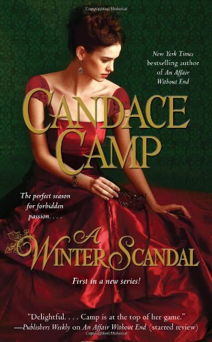
Caro: I like that they didn’t overdo the Xmas theme on the Tessa Dare book. Only the green dress is pointing in that direction. It’s a pretty historical cover. Very classic but I like how she’s posing. I just wish we didn’t see that man’s face LOL.
The Christmas Secret doesn’t look right. I mean there’s something weird. It does look like it’s been photoshopped. I think it’s the colors they don’t look realistic. Anyway the colors are overdone. I like her simple dress though but I wish the red title and author name weren’t so huge.
Yes Red and Green we got it, Xmas-y. *sigh* The Winter Scandal cover isn’t bad. I like the dress my only complain is the weird background. It’s an easily forgettable cover altogether. :/
Conclusion: Meh Xmas Historical romance covers are not very original and they tend to overdo the Xmas colors.
Susi: What is that in the background of the Tessa Dare cover? *squints eyes* Ahhhhh a table and a plant. LMAO I saw a robot. Bwahahah. Well it is a historical cover so meh font and well woman in weird pose. Don’t like the green dress at all. The color is a bit bland. *shrug* And well now that you pointed out the dudes face I wish it wouldn’t be there either. Will look at the robot instead., Bwahahahha!
The girl on The Christmas Secret cover looks like one of those models we have ight now- starved and unkempt. Seriously, I want to feed her and let her take a bath afterwards. Are there pink highlights in her hair? O_o
I actually do like the last cover. The dress and pose are nice but the background really looks weird. But My fave of these three.
Small Town Xmas romance:
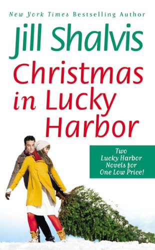

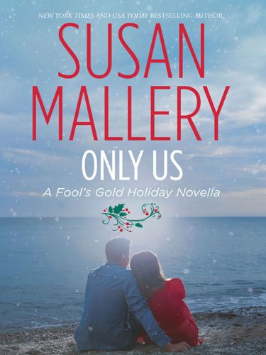

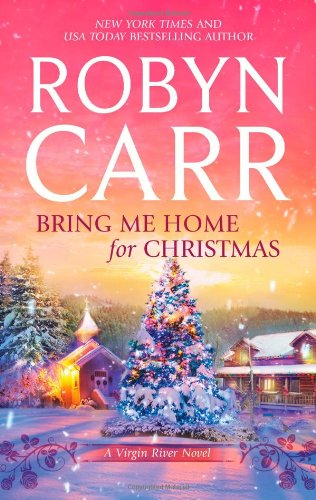
Caro: I can’t help but smile at these covers. Look at them all and you can see the classic Xmas themes on covers. Red title. Mistletoe or Xmas tree, snow. They make me want to snuggle under a cover with a good book while it’s snowing outside. I love the cozy effect they have on me. *g* Yes they aren’t original at all but these covers play it right. They are simple and traditional but they reach their goal, you can’t help but notice the Xmas theme. Now I’m craving that hot chocolate on the Holly Lane cover. 😉
Susi: I don’t like the Lucky Harbor covers in general. Too much white for me. And well the Mallery looks like it got its Christmas touch afterwards. I really like the other 3- I could so buy those right now. Pretty, pretty. And yum hot chocolate.
Paranormal for Xmas:


Caro: Ewwwwwww. O_O. Please let me first tell you that I really dislike the pun in the title. Bite Before Christmas…really? That’s what you’re going for? It’s been done a thousand times before.
The anthology cover is Meh. I like that guy’s face very much. NOM looks at that wicked half smirk. Nom. But I don’t like the color nor the font. Also I find it weird that we don’t see the authors’ names on the cover. Also the white ‘snowflakes’ really don’t look like snowflakes. So yeah Love the guy hate the rest.
Sweet Magik, what an appropriate title. I like it very much! HOOOOOOT hot hot! The colors, the font and the snowflakes all work great together.THIS looks like a finished cover. it’s well done and yeah sexy to boot. The holiday theme is subtly included. 2 thumbs up.
Susi: Bwahahhaah we have those “funny” bite titles here in Germany for nealy all vampire books. Sometimes it feels like “When I see one more ‘bite’ pun I will strangle someone.” The cover itself would be okay if the guy in the middle wouldn’t look so creepy and totally unsexy. Seriously, he makes me want to run away.
The anthology cover is as you said meh and also where are the author names? For everyone who’s interested the authors are: Laurie London, Michelle Hauff, Caridad Pineiro and Alexis Morgan. I always thought that this is essential on a cover. But the guy is hawt.
I adore the Sweet Magik cover even though it’s blueish. I know, I shocked you all. But it’s soooo purty- I want to pat the abs like now. *dreams*
Caro: *pats abs with Susi* Hummmm Yummilicious.
Caro:
+ Sweet Magik
– The Bite Before Christmas
Susi:
+ wow we do agree- Sweet Magik
– Unwrapped
What do you think of these covers? Which do you like? Which do you hate?
Is there something you LOVE on your Xmas/holiday covers? Something you really can’t stand?
Do puns in Xmas titles make you want to roll your eyes to death too? I mean seriously how many puns with The Night/bite/knight Before Christmas can they make????
Do you think the author’s name should be seen on the cover even in an anthology?
Of course feel free to contradict us, we love that too*g*
Share This Post
Related Posts
Subscribe and stay up-to-date
26 Comments
« Review: Dangerous Charade by Elizabeth Means Next Post
Advent Calendar Day 6: Open Minds by Susan Kaye Quinn + Giveaway! »


 Blog RSS Feed
 Follow Me on Twitter
 My Facebook
Vampire for Chrstmass mwhahahaha! the cover is good though!
Yep LOL indeed. Yummy guy though. I highly approve.
Good thing it compensate 😉
You girls always make me look more closely on covers then I normally do. And I agree, most are just adapted for Christmas, or plain ugly like that Julia London book. For the rest, I agree with you, like the last cover best.
Thank god you agree on the London cover.
Makes me think of that very sad faery tale, the girl with the sulphor sticks (match sticks).
So true. LOL 😛
That’s a very good description. She does look starved. Poor girl
The Shalvis one is lovely and screams xmas so I am going for that one 😀
Lol, bite bite bite
I want thee new Lucky Harbor one no matter what it looks like. And evil you!!!!
I do like it too!
And LOL you know titles with Bite in the covers always have people around me a little shocked…why ? Because The word Bite in french is How we call a peen LOL
Bwahhahahah!
there i two books i really want but i admit their cover aren’t the best
my favorite is holiday hideout not too much and we still feel the magical atmosphere
Well covers don’t hold me back if I really want a book either. 😉 it’s an addiction. And I’m tempted by Holiday Hideout too.
That makes 3 of us!!
I have the paranormal ones and have to start reading them this week 🙂
Enjoy hon!
Awesome. Agree that bite before Christmas is a lame title. And those are some crazy abs on magick. 🙂
Crazy good? If not, I’m happy to take him out of your view. 😉
I like Sweet Magik. Love the hunk on the cover and those abs are to drool for! Sexy and Hot!
I agree 100%. Yum yum yum
Ditto! It’s real eyecandy *g*
And if the story is as good as the cover, I’m getting it! :o)
I think it’S book 2 in a series. I’m sooooooo tempted by those. Wants!
I love the covers. I think they all are great, but I really like it when you get a close up of a cover models face and his eyes are so breath taking.
Well I do like those when I like the face. I can be rather shallow that way. 😉