Book Lovers Inc.
Romance Novel Reviews, Author Interviews, Commentary
The Good, the Bad and the Are-You-Kidding-Me?
 Welcome back to The Good, the Bad and the Are-You-Kidding-Me? our bi-weekly cover discussion (<==criticizing-fest).
It’s been a while since we last take a look at what was coming out in Germany. Susi found us quite a few gems to work with. So let’s remember it’s all just for fun and let the cover talk begin.*g*


Lara Adrian‘s cover is ‘nice’ but it’s the kind I would forget in 2 seconds. I like the sensual lips but otherwise it’s a it generic. All the covers in this series are made the same way, I know it’s to give the series the same look but in the end I just end up confusing them all.
The Frost cover just doesn’t work for me. Not because I don’t like the cover but because it doesn’t fit the series/story/character at all. When I first saw the cover I thought it was a Fantasy book. THAT could have worked. So yeah for another book why not, but for this series it’s a big No-no!
Susi: As I’m not much of a YA fan I never really noticed the Shatter Me cover but the German version really caught my eye. The setting is spot on and well I like how her dress moves into those swirly thingies at the bottom. It’s really classy and looks professional. All thumbs up.
I do like Lara‘s German covers but I never know which book is which. With just showing the faces and nothing really from the story it’s hard to tell them apart (this one is Midnight Breed #10). I like the colors of this one and well yes her lips are great.
The cover of Verlockung der Nacht (Night Huntress 6) is as you said- this is so not Cat. I really adore the US cover model and well it really doesn’t look like an urban fantasy novel at all. the dreamy background makes me think romance perhaps with fantasy/fae angle but well not vamps at all. Perhaps we shouldn’t complain because at least we don’t have bats. LOL


Ok so by now you all know that I hate the US covers for the psy/changeling series.(I’m in freaking love with the UK covers *drools*). Anyway, if I had to choose between US or German I’d go German. Yes it’s a bit bland and unoriginal. And he has a weird body and nearly no head. BUT still not as bad as US LOL <== ain’t it sad when you have to choose between bad and worst?
The Cabot cover is a bit boring. I do like her dress though but otherwise it’s not making much of an impression on me.
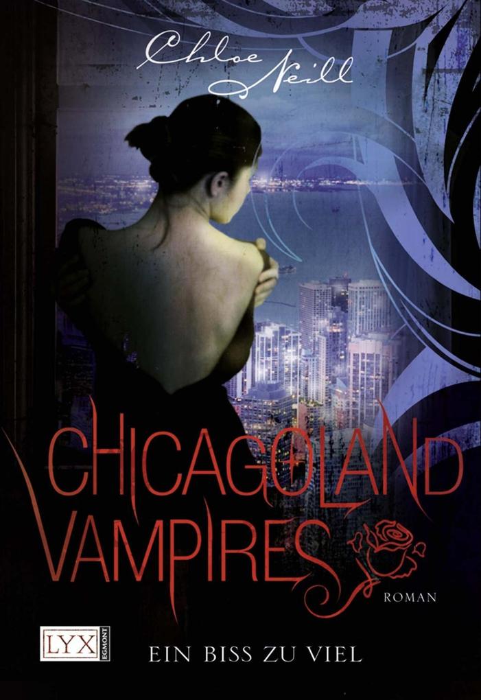
Susi: Yes and amen about the Chloe Neill cover. It’s a pretty cover that does nearly everything right. It catches the eye and it’s artfully done in a professional style BUT well the important part is all wrong. It doesn’t fit the book. The girl looks all soft and romantic. LOL
Lockruf der Verlangens (Psy Changeling #10) is the first German Singh cover I really don’t like much. It’s not as eye-catching as the other ones. It’s well executed as in the chest doesn’t look just pasted in but well it still makes me go all meh.
The Endless (Insatiable #2) cover is really awesome.. I usually HATE blue but the dress is just nice. I also like the swirl and how contrasting the font is to it with it’s straight unadorned lines. All thumbs up!


LOL you gotta love Susan Mallery‘s German covers. Seriously they are an acquired taste (even if first look always makes me cringe lol) .I’m not sure which book this is but the cover is kinda funny. It cries CHICK-LIT to me but that’s not obligatory a bad thing. It’s not very original but I like the way the title is written. Maybe it’s just that I need coffee but she kinda looks like Katy Perry. Ok I DO need coffee LOL.
Noooooooooo! Ugh!! Gahh!! Grrrr! Yes the Clockwork Prince cover made me regress to a non-verbal state. Why?????? I LOVED the US cover. It was sooo pretty (Cue Susi reminding me how she disliked it LOL *wink*) but THIS???? thiiiiiiiis is horrid. You know what? I could have accepted if the cover was made with just the center part, where we see the shadow of the man with the bridge . But not the ugly blue and green mess around it. I feel like barfing the coffee I haven’t drank yet LOL.
Susi: The German Rescue Me cover is cute. LOL It looks funny and well it has the typical German I’m a kinda-chic-lit-book look. I didn’t really think of a YA title but well German YA titles never have a cover like that.
The German Husband By The Hour cover is probably one of the best Mallery has here. It looks fun, cute and a bit daring. I like how they used the egg-timer as the 8. Kinda nice.
Well when I saw the German Clockwork Prince I was speechless. Seriously, the US covers aren’t my fave cover ever but this makes them look exceptional. What did they do to it? It looks cheap and like something I could put together in Photoshop in about an hour. And LOl yes ugly green mess says it all. LMAO
What do you think of these covers?
Anything you like? Hate? Meh?
Doesn’t the Gibson cover looks like YA to you? (I hate when I can’t tell if a book is YA or not by looking at the cover)
Anyone else is wondering why most of these covers seems to have Blue theme?
Share This Post
Related Posts
Subscribe and stay up-to-date
14 Comments
« Review: Once Burned by Jeaniene Frost Next Post
Guestpost by Author Moira Rogers + Giveaway »


 Blog RSS Feed
 Follow Me on Twitter
 My Facebook
the “german” cover of Shatter Me looks exactly like the cover for Carrier of the Mark: http://www.readbreatherelax.com/wp-content/uploads/2011/10/carrier-of-the-mark.jpg
Ohh indeed it’s nearly the same O_o. I hate when that happens. I found it happens a lot with translations.
But somehow I like the one for Shatter Me better
Oh dang, I hate when they do that. >.<
All covers kind of suck today here. Kind of like the chick-lit ones, but they are so generic
There’s nothing really exciting coming out these days. I hope it’s only because it’s Summer time and less book covers are being revealed. 🙁
Aren’t we Germans lucky. 😉
They’re all kind of MEH. Nothing to write home about. Oh, well.
yeah I hope we’ll get better new stuff soon
We need something new and fresh- I agree.
Unless “Endless” is a fairy tale about the dress that never-ends, the Cabot cover is ridiculous (seriously, how can there be that much fabric for one tiny woman’s dress?)
The Gibson cover doesn’t look YA – it looks like a MG princessey book about an entitled rich girl throwing a tantrum. In short: NEVERNEVERNEVER.
I actually think the Jeanine Frost cover looks YA. That’s a big thing in YA these days, all zoomed in pretty girl heads with fantastical background scenery. Jeanine doesn’t do YA, does she?
LOL I admit I have no idea what the Endless book is about. But I hope the dress plays a part in it =P
Now that you point it out it does look like a tantrum princess cover LOL
Yeah I just don’t get the background on the Frost cover. It’s my main problem about it. It just feels Fantasy to me.
LOL, am I the only one here who doesn’t hate the German cover of The Clockwork Prince?
I think it looks okay 😛
Looks like it 😉 LOL My problem is that it looks like a KID book with such a cover. And I loved the original cover so much it’s hard to change to this! *sigh*
I don’t hate it either. I don’t love it or anything. But I love me some steampunk – so as long as I can look at it and think of awesome steampunk bling….then it’s okay.