Book Lovers Inc.
Romance Novel Reviews, Author Interviews, Commentary
The Good, the Bad and the Are-You-Kidding-Me?
 This week it’s time for a battle of the European covers again. We did our best to raid the local amazon sites to find something pretty and shiny or just awfully disgusting for you to look at. It was a hard task but we did our best. *wipes sweat from her brow*
You are welcome to join the discussion and judge the covers as you see fit. If you want to see a bigger version of one cover just click on it and one should pop up. Don’t be shy and tell us what you really think. Can’t wait to hear your thoughts.



Geist by Phillippa Ballantine | Collide by Megan Hart | Hounded by Kevin Hearne
Susi: The German Geist cover surprised me. I do love the US cover, it’s pretty awesome, but this one is different but still kind of has the same vibe. I really like the pale background. What actually made me wonder though is the title. Geist is German word for ghost so in my head I’d always assumed they would use that here- but well they didn’t. They get off on those stupid ass long titles + subtitles. Oh well.
The German cover of Collide by Megan Hart is pretty but not what I would expect for an erotic novel. She looks so young and well it suggest a young heroine and probably a more romantic book. Not that Collide isn’t that- but well it’s not one of those cute little puppied we will fall in love forever at first sight kinda book. And the title is weird. “The smell of oranges” – that actually makes me wanna read the book to see where that came from. LOL
Okay so hands down, the German Hounded cover just rocks my socks off. Seriously awesome. Go on and click on it to see it in it’s full glory. I love how Atticus and Oberon look. Just magnificent. I really want to buy just to have the pretty in my shelf. it looks mysterious and also pop-culture-y like the book. Totally caught the vibe of the story with this one. All thumbs up1
Caro: Ohhhh that’s Geist? *g* I really like it! I loved the US cover but this is super nice. It looks pretty neat. I think she looks even more badass on this cover. 2 thumbs-up!
Hummm until you mentioned that it was Collide I had NO idea which Megan Hart that was. It doesn’t really fit with any of her stories but oh well, if you saw the French covers you’d find this one nice lol. As you said, it’s pretty but doesn’t scream Erotica!
i LOVEEEEEEEE the cover for Hounded. WOW. I’m super jealous I don’t have the book with that cover. It’s just awesome that we see Oberon. And well it just fits the book perfectly. I’m in love. Just awesome. Perfect. Fantastic. Marvelous. Ok I’ll stop now lol

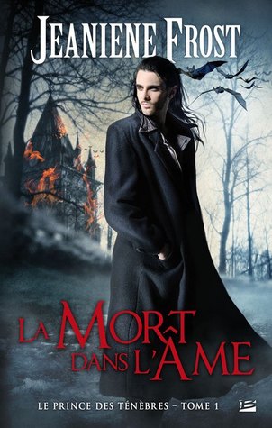

Hunted by the Others by J. Haines | Once Burned by J. Frost | Personal Demons by S. Kane
Caro: As much as I HATED the original cover for Hunted by the Others…I do like this one. Yes I know it’s pretty generic, but at least it’s not ugly.I love that it’s simple. I love the super vibrant red hair too. It might not be super original but at least it’s an improvement to the original.
*sob* No you’re not dreaming, this is the French cover for Once Burned by Jeaniene Frost. OMG it’s ugly. I hate everything about it. He looks disgusting, like he hasn’t showered in 5 centuries. I also really don’t like how they tried to do a blurry effect to showcase the castle in the background. You gotta choose people, either the guy in the front is the focus or the castle in the back…not both with blurry in the middle! Blerghhh
I like the cover for Personal Demons, it’s way better than the original. It’s simple once again but nice. Pretty shades of gray (ughhhh now i’m thinking about The-Book-That-Shall-Not-Be-Named)
Susi: Okay I love this of Hunted by the Others– as you said the US one is craptastic and well this one looks mysterious and pretty. Now idea how it fits the book though.
OMFG what did they do to Vlad? Seriously, our little firecracker doesn’t deserve this. He looks like a perv escaped from a bad taste asylum. Jeeez, and the French do seem to love their tropes. Why can’t they all just get rid of the stupid bats.
Okay I admit this cover for Personal Demons is better than the US one but it confuses me even though it looks nice. The floor is cracked and her shadow looks like an imperial eagle. LOL Well the gray is nice- looks classy. Okay I said nice too often about this one. As we say here in Germany nice is the little sister of shitty.
Caro: In defense of the French…we have bats on the US covers too! I think book 2! Not that I like them at all but oh well…
Oh I was gonna say ‘chicken’. It looks like she’s a frightened chicken!
Caro’s:
Yay: Hounded by Kevin Hearne (Geist comes 2nd)
Nay: Once Burned by Jeaniene Frost
Susi’s:
Yay: Hounded
Nay: Once Burned
OMG we agree!!! First time for everything!!
So what do you say? Which one is your favorite? Which one do you hate?
Do you also think Vlad looks like a perv waiting to flash his genitals to the first person he sees?
Share This Post
Related Posts
Subscribe and stay up-to-date
32 Comments
« Review: Exiled (Cherished Duology) by Maya Banks Next Post
Review: Playing the Maestro by Aubrie Dionne »


 Blog RSS Feed
 Follow Me on Twitter
 My Facebook
I do like Geist and the Haines cover 🙂
But the Hart one is all wrong
It is indeed. Looks a bit YAish.
I’m honestly wondering how they sell these Megan Hart books. it’s the same thing in France, the covers just have a flower on the cover and that is all. I’ve SEEN these book in my store and they aren’t in the ‘erotica’ section. Actually, they have 1 section where they put what they call ‘Bit-Lit’ (basically UF), PNR,Historical romances, erotica. ALL in one place. So I have no idea how people know what genre the books will be . *shrug* Kind of things that make me angry.
What?! The French removed Paul Marron from the ONCE BURNED cover? What were they thinking?!!!
Yep! I guess this is the Fench version of a hot guy…Bwhahahahahah It’s ridiculous! *sigh* Oh well , good thing I don’t read in French
LOL It seems they aren’t very smart that way.
I am so laughing here. I didn’t think the Frost cover was that bad, but I can’t bear to look at Vlad now–all I can think of is him getting ready to flash unsuspecting passersby.
I didn’t think the Hounded thumbnail was anything special ’til I clicked on it. Love it. The US cover is good, but this is even better–more like what I think Atticus looks like in my head.
“Nice is the little sister of shitty.” I’m sure I can work that in a conversation sometime. 🙂
LOL we’re glad we could help ruin a cover for you 😉
Exactly!! Atticus and Oberon both look like what I imagined. I did love the US covers but he looks shabbier here and it fits the story. So cool
This cover is sooo awesome. Seriously I’m staring at it way often.
I think you guys were right on all accounts. The Hounded is fabulous!
Thank you. And I agree 100%
I admit I’m both curious and afraid to see what will be the French cover for Hounded lol
not really happy about the french covers especially for Vlad
Me neither- looks so creepy.
Vlad’s is YUCK! Sometimes we get pretty covers but more often than not they suck
Favorite is definitely the German cover for Hounded…..least favorite is a tie for me between the French cover for Once Burned or the German cover for Geist
Oh not a Geist fan? Out of curiosity, what don’t you like about it?
*g* We agree on Vlad’s! Like Susi i’m curious to know what you dislike about Geist!
I liked both Traquee and La Mort dans L’Ame! See?We can’t all agree!
We will at some point, I’m sure. We will just have to keep searching. 😉
Hehe it would be boring if we all agreed! *g* Well at least Vlad gets one vote!
I think I agree with you two, I really like the Kevin Hearne cover. I also really like that cover for Personal Demons.
YAY Hounded seems to be the winner all around. *g*
*g* I’m glad Personal Demons gets a vote too!
I normally get so jealous of the UK/AU/European covers. Because the big US publishers lack any real sense of artistry!
And then you go and how me covers like THESE and I am forced to rethink my sweeping generalizations. Next thing you are going to tell me that food isn’t universally better in Italy and Greece (even though it TOTALLY was when I was there).
Seriously? Not even Hounded? But it’s so pretty. And Oberon actually looks like a wolfhound- that should get some points.
Oh, and Susi? You’re spot on about Vlad. In fact, I think he did a brief (off-page) guest spot in my favorite webcomic….
http://agirlandherfed.com/1.84.html
LOL that made my morning.
I agree with y’all. Hounded is the best. Once Burned is the (greasy) worst. Fun post. Thanks.
YAY and greasy indeed. BTW now I imagine a slippery slimy book. YUCK!
Okay wow the close up of Hounded is pretty amazing!
It so is. *stares at pretty some more*